

Mobile-friendly web design services have become increasingly crucial in today’s digital landscape.
As more and more people access the internet through mobile devices, having a website that adapts seamlessly to different screen sizes and provides an optimal browsing experience is essential.
Key Elements of Mobile-Friendly Web Design
To create a mobile-friendly website, several key elements need to be considered:
Responsive design
Responsive design ensures that your website layout adjusts dynamically to fit the screen it is viewed on. This allows users to have a consistent and visually pleasing experience, regardless of whether they are browsing on a desktop, smartphone, or tablet.
Fast loading speed
Mobile users expect websites to load quickly. Optimizing image sizes, leveraging caching techniques, and minifying code are some of the strategies that can be employed to improve loading times.
User-friendly navigation
Clear and intuitive navigation is vital for mobile users. A simplified menu structure, easy-to-find buttons, and logical hierarchy help users find the information they need efficiently.
Clear and readable content
Content readability is essential on mobile devices. Using legible fonts, appropriate font sizes, and ample spacing between paragraphs and headings ensures that users can consume the content easily without zooming or scrolling excessively.
Benefits of Mobile-Friendly Web Design Services
Investing in mobile-friendly web design services brings several advantages to your business:
Enhanced user experience
A mobile-friendly website provides a seamless and enjoyable browsing experience, making it easier for users to find information, navigate through pages, and engage with your content. This positive experience fosters trust and encourages visitors to stay longer on your site.
Improved search engine rankings
Search engines, like Google, prioritize mobile-friendly websites in their search results. Having a mobile-optimized website can improve your visibility, driving more traffic to your site and increasing your chances of attracting potential customers.
Increased mobile traffic and conversions
With the growing number of mobile users, having a mobile-friendly website allows you to tap into a larger audience. By catering to mobile users’ needs and preferences, you can attract more mobile traffic and potentially convert them into loyal customers.
Competitive advantage
A mobile-friendly website gives you a competitive edge over businesses that have not yet optimized their websites for mobile devices. By providing a superior mobile experience, you can stand out from the crowd and leave a lasting impression on your visitors.
Best Practices for Mobile-Friendly Web Design
To ensure your website is optimized for mobile devices, consider the following best practices:
Prioritizing mobile responsiveness
Make sure your website layout and design are responsive and adapt seamlessly to different screen sizes. Test your website on various devices to ensure a consistent user experience.
Optimizing images and media
Compress and optimize images to reduce file sizes without compromising quality. Use responsive image techniques to deliver the appropriate image sizes to different devices.
Using legible font sizes
Choose font sizes that are easily readable on smaller screens. Avoid using fonts that are too small or require excessive zooming.
Implementing touch-friendly elements
Design your website with touch gestures in mind. Use buttons and interactive elements that are easy to tap with a finger, ensuring a smooth and frustration-free browsing experience.
Common Challenges in Mobile-Friendly Web Design
While mobile-friendly web design brings numerous benefits, it also presents certain challenges that need to be addressed:
Compatibility across devices and browsers
Ensuring your website functions properly and looks consistent across various devices and browsers can be challenging. Regular testing and optimization are necessary to accommodate different screen sizes, resolutions, and operating systems.
Content prioritization
With limited screen space on mobile devices, prioritizing content becomes crucial. Identify the most important information and make sure it is prominently displayed and easily accessible.
Ensuring fast page load times
Mobile users expect fast-loading websites. Optimizing code, reducing server response times, and leveraging caching techniques are some strategies to improve page load speed.
Testing and debugging
Testing your website thoroughly on different devices and browsers is essential to identify and fix any issues that may arise. Debugging and troubleshooting compatibility or performance problems will ensure a smooth user experience.
Mobile-Friendly Design Trends
The field of mobile-friendly web design is constantly evolving, and keeping up with the latest trends can help you stay ahead. Consider incorporating the following trends into your mobile-friendly website:
Accelerated Mobile Pages (AMP)
AMP is an open-source framework that aims to provide lightning-fast loading times for mobile web pages. Implementing AMP can significantly enhance the speed and performance of your mobile website.
Progressive Web Apps (PWA)
PWAs are web applications that offer a native app-like experience on mobile devices. They combine the best features of websites and mobile apps, providing fast, reliable, and engaging experiences.
Voice search optimization
As voice assistants and smart speakers become increasingly popular, optimizing your website for voice search can improve discoverability and user engagement. Consider incorporating natural language queries and long-tail keywords in your content.
Gesture-based navigation
With the rise of edge-to-edge screens and bezel-less devices, gesture-based navigation is gaining popularity. Incorporating intuitive swipe gestures and interactions can enhance the user experience on mobile devices.
How to Choose a Mobile-Friendly Web Design Service Provider
When selecting a service provider for mobile-friendly web design, consider the following factors:
Assessing portfolio and experience
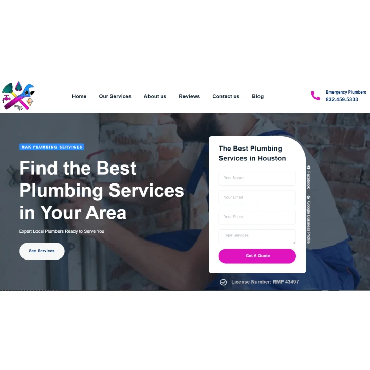
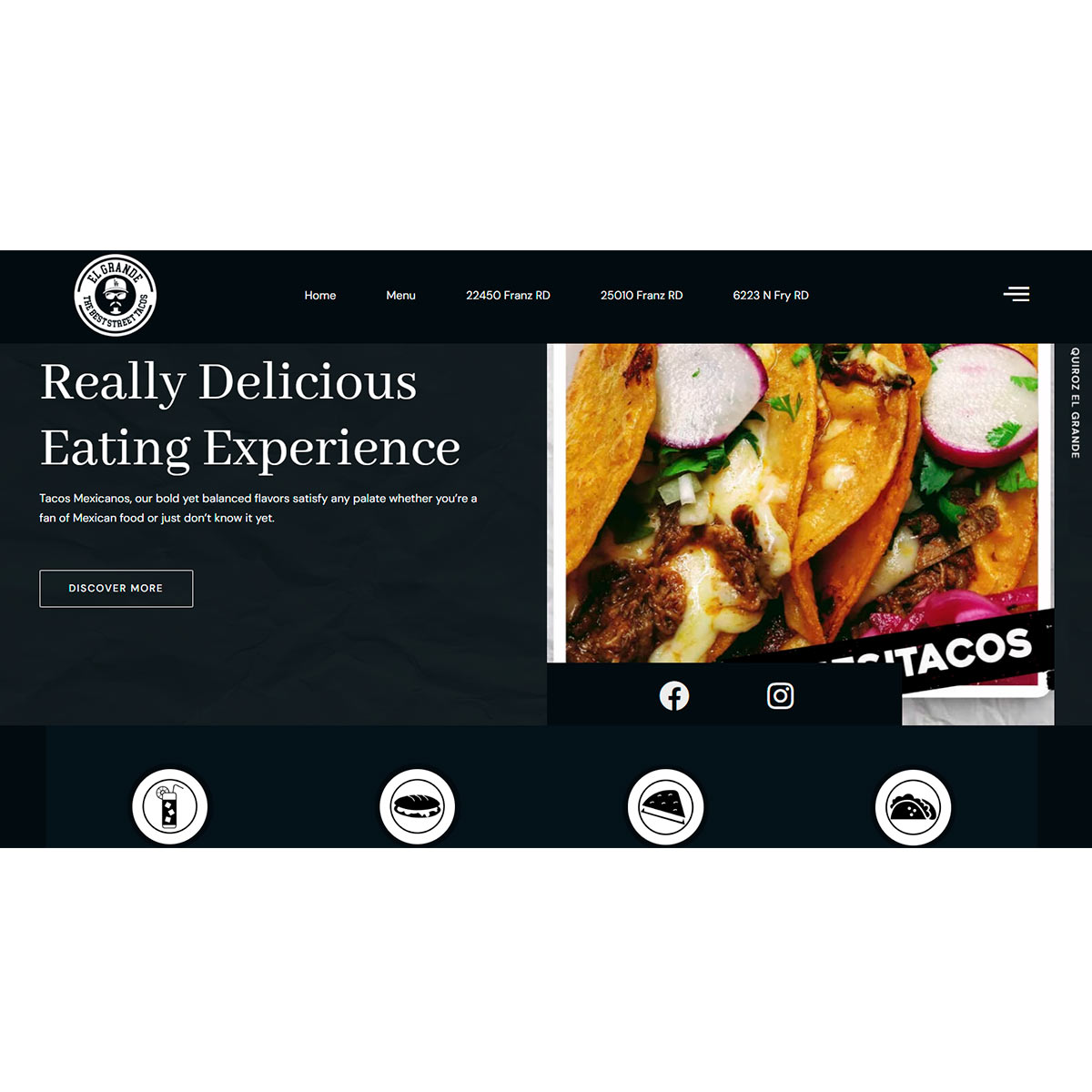
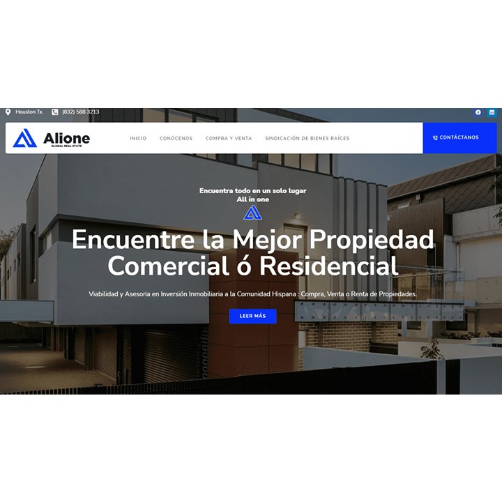
Review the provider’s portfolio to see examples of their previous mobile-friendly web design projects. Assess their experience in creating visually appealing and functional websites for mobile devices.
Evaluating client testimonials
Reading client testimonials and reviews can give you insights into the service provider’s reputation and the quality of their work. Look for positive feedback and satisfied clients who have benefited from their mobile-friendly web design services.
Inquiring about responsive design approach
Ask the service provider about their approach to responsive design. Ensure that they prioritize creating websites that adapt seamlessly to different screen sizes and devices, providing an optimal user experience.
Checking for ongoing support and maintenance
Inquire about the service provider’s post-development support and maintenance offerings. A reliable provider should offer ongoing assistance, ensuring that your mobile-friendly website remains up to date and performs optimally.
Conclusion
In today’s mobile-dominated world, having a mobile-friendly website is essential for businesses to thrive online. By implementing responsive design, optimizing loading speed, prioritizing user-friendly navigation, and ensuring clear content, you can provide an enhanced user experience and gain a competitive edge. Embracing mobile-friendly web design trends and selecting a reputable service provider can help you create a website that attracts mobile traffic, improves search engine rankings, and drives conversions.